
9
Figure 11 summarizes the qualitative aspects of the
quantitation as a function of the levels spiked and the
confidence in the isotopic overlap between experimental
and theoretical values. The response at each level
represents over 30 measurements where all charge states
across each quantitation curve were considered. As
expected, the lower levels resulted in a lower average dot
product correlation coefficient (0.58 for all insulin
variants spiked at 1.5 pM). However with six isotopes
considered, the coefficient was discriminatory and
accurately defined potential background interference that
would disrupt the true isotopic distribution in the four
most abundant isotopes. Even at very low analyte levels,
the quality of the quantitation is quite high. All other
levels generated average dot product correlation
coefficients greater than 0.8. The average dot product
coefficients for porcine measurements were consistently
above 0.97 for the 50 pM level.
Quantitation curves were generated based on user-defined
levels. To best match the relative AUC values, each charge
state was used to normalize the corresponding charge
state for human insulin. This provided a significant benefit
as relative abundance values are generally not equivalent,
and simply summing and normalizing AUC response per
target will bias towards the most abundant charge state.
Normalizing at each charge state and showing the
summed response for each individual charge state, takes
advantage of HRAM data to increase the discriminatory
power of the method.
As shown in Figure 9, the top right table shows the
cumulative quantitation results for the row highlighted
and contains all of the values used to evaluate the
quantitation, including the %RSD and calculated
amounts. Specific values can be added or subtracted.
When a row in the table is selected (highlighted in blue),
the accompanying results are graphically displayed in the
bottom half of the window. The bottom left of Figure 9
shows the normalized quantitation curve for human
insulin. The curve is weighted by 1/x and the equation is
displayed. The bar chart (bottom middle) displays the
relative AUC values for the six isotopes across the spiked
levels. As reported in the upper right table, only the lowest
spiked amount (1.5 pM) could not be used to identify all
six isotopes. The graph on the lower right displays the
XIC data for any single RAW file selected and can be
changed by clicking on any point in the quantitation curve
or bar chart.
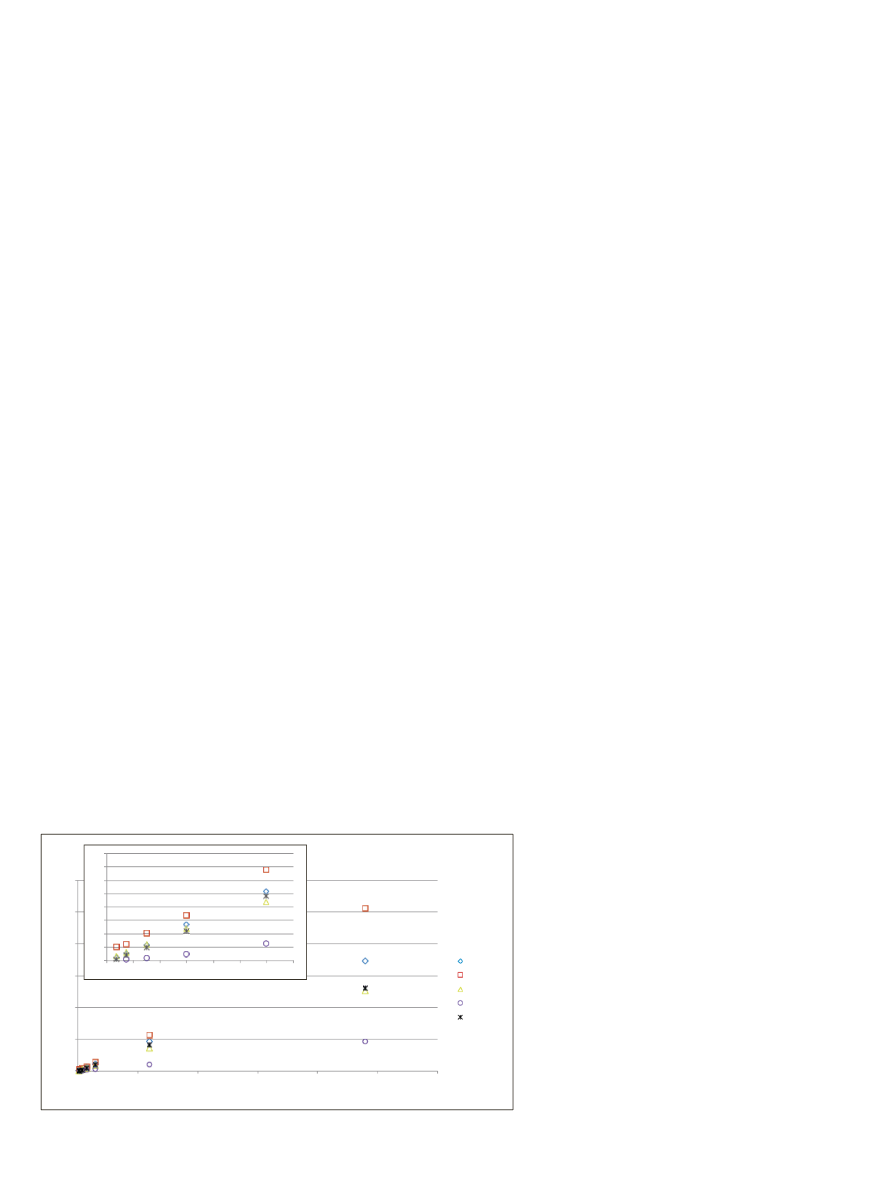
The cumulative results from individual quantitative curves
for the first sample set were overlaid to demonstrate that
the workflow was global in its ability to quantify the
different insulin variants (Figure 10). Each curve, when
normalized to porcine insulin, had a linear regression of
0.98 or greater for all precursor charge states, isotopes,
and reported summed AUC values. The difference in
slopes was attributed to the relative ionization efficiency
and antibody binding coefficients of the different insulin
analogs. The workbook used to process the insulin
quantitation curves spiked into PBS/BSA was also able
to process the insulin quantitation curves spiked into
human plasma.
0
5
10
15
20
25
30
0
200
400
600
800
1000
1200
AUC Ratio [Insulin Variant:Porcine]
Spiked Amount of Insluin Analog (pM)
Humulin S
Lantus
Apirda
Bovine
Novorapid
0
0.2
0.4
0.6
0.8
1
1.2
1.4
1.6
0
10
20
30
40
50
60
70
Figure 10. Comparative quantitation curves for all insulin analogs spiked into PBS/BSA
matrix. The AUC values were normalized against the measured AUC value for porcine.


